hazrd provides a consistent API for computing
survival-based discrimination metrics and visualizing Kaplan-Meier and
cumulative incidence curves stratified by polygenic hazard score (PHS).
The primary user-facing functions are phs_metrics() for
statistics, phs_km_curve() for Kaplan-Meier plots,
phs_cox_curve() for Cox model-based survival curves at
specified PHS percentiles, and phs_abs_risk() for
cumulative incidence (absolute risk) curves.
Data
The package ships with a simulated survival dataset,
test_data. The three required columns are phs
(continuous score), age (time to event or censoring), and
status (event indicator: 1 = event, 0 = censored).
Here is our test data included in the package.
head(test_data)
#>          phs      age status
#> 1  0.8425735 67.95011      1
#> 2  1.1151321 56.31356      0
#> 3 -0.3777455 72.94103      1
#> 4  0.1201511 82.01571      1
#> 5 -0.4041602 74.33629      1
#> 6 -0.4531890 77.15814      1
Computing metrics with phs_metrics()
phs_metrics() is the single entry point for all
discrimination statistics. It fits a Cox proportional hazards model and
derives metrics from the fit. The metrics argument controls
which statistics are computed; column names are passed as strings and
default to "phs", "age", and
"status".
All core metrics in one call
metrics <- phs_metrics(
  test_data,
  metrics  = c("HR", "C_index", "OR", "HR_SD"),
  or_age   = 70
)
metrics
#> # A tibble: 4 × 9
#>   metric      estimate conf_low conf_high    se n_numerator n_denominator method
#>   <chr>          <dbl>    <dbl>     <dbl> <dbl>       <int>         <int> <chr>
#> 1 HR[80-100]…    8.17        NA        NA    NA         200           200 conti…
#> 2 C_index        0.708       NA        NA    NA          NA            NA harre…
#> 3 HR_SD          2.12        NA        NA    NA          NA            NA NA
#> 4 OR[80-100]…    8.52        NA        NA    NA         200           200 NA
#> # ℹ 1 more variable: adjusted <lgl>
The returned tibble has one row per metric. conf_low,
conf_high, and se are NA until
bootstrapping is enabled.
Hazard ratio
By default phs_metrics() computes
HR[80-100]_[0-20] — the ratio of the top 20% to the bottom
20% of the PHS distribution. Use hr_numerator /
hr_denominator to change the bands:
phs_metrics(test_data, metrics = "HR", hr_numerator = 0.90, hr_denominator = 0.10)
#> # A tibble: 1 × 9
#>   metric      estimate conf_low conf_high    se n_numerator n_denominator method
#>   <chr>          <dbl>    <dbl>     <dbl> <dbl>       <int>         <int> <chr>
#> 1 HR[90-100]…     13.7       NA        NA    NA         100           100 conti…
#> # ℹ 1 more variable: adjusted <lgl>
For multiple HRs in one call, supply hr_pairs:
phs_metrics(
  test_data,
  metrics  = "HR",
  hr_pairs = list(
    list(numerator = c(0.80, 1.00), denominator = c(0.00, 0.20)),
    list(numerator = c(0.80, 1.00), denominator = c(0.40, 0.60))
  )
)
#> # A tibble: 2 × 9
#>   metric      estimate conf_low conf_high    se n_numerator n_denominator method
#>   <chr>          <dbl>    <dbl>     <dbl> <dbl>       <int>         <int> <chr>
#> 1 HR[80-100]…     8.17       NA        NA    NA         200           200 conti…
#> 2 HR[80-100]…     3.05       NA        NA    NA         200           200 conti…
#> # ℹ 1 more variable: adjusted <lgl>
Odds ratio
The OR is computed from Kaplan-Meier survival estimates at a specific
age. or_age accepts a vector; one row is returned per
age:
phs_metrics(test_data, metrics = "OR", or_age = c(65, 70, 75))
#> # A tibble: 3 × 9
#>   metric      estimate conf_low conf_high    se n_numerator n_denominator method
#>   <chr>          <dbl>    <dbl>     <dbl> <dbl>       <int>         <int> <chr>
#> 1 OR[80-100]…     8.22       NA        NA    NA         200           200 NA
#> 2 OR[80-100]…     8.52       NA        NA    NA         200           200 NA
#> 3 OR[80-100]…    19.1        NA        NA    NA         200           200 NA
#> # ℹ 1 more variable: adjusted <lgl>
Bootstrapped confidence intervals
Set bootstrap = TRUE to populate conf_low,
conf_high, and se. Use a small
n_boot for speed during development:
phs_metrics(
  test_data,
  metrics   = c("HR", "C_index", "HR_SD"),
  bootstrap = TRUE,
  n_boot    = 300,
  seed      = 42
)
#> # A tibble: 3 × 9
#>   metric     estimate conf_low conf_high     se n_numerator n_denominator method
#>   <chr>         <dbl>    <dbl>     <dbl>  <dbl>       <int>         <int> <chr>
#> 1 HR[80-100…    8.17     5.93     11.8   1.36           200           200 conti…
#> 2 C_index       0.708    0.680     0.734 0.0139          NA            NA harre…
#> 3 HR_SD         2.12     1.90      2.42  0.124           NA            NA NA
#> # ℹ 1 more variable: adjusted <lgl>
Non-default column names
Column names are passed as strings, making phs_metrics()
straightforward to use with non-standard data frames:
test_data2 <- with(test_data, data.frame(
  score     = phs,
  diagnosis_age = age,
  case      = status
))

phs_metrics(
  test_data2,
  phs   = "score",
  time  = "diagnosis_age",
  event = "case",
  metrics = c("HR", "C_index")
)
#> # A tibble: 2 × 9
#>   metric      estimate conf_low conf_high    se n_numerator n_denominator method
#>   <chr>          <dbl>    <dbl>     <dbl> <dbl>       <int>         <int> <chr>
#> 1 HR[80-100]…    8.17        NA        NA    NA         200           200 conti…
#> 2 C_index        0.708       NA        NA    NA          NA            NA harre…
#> # ℹ 1 more variable: adjusted <lgl>
Kaplan-Meier curves with phs_km_curve()
phs_km_curve() stratifies the cohort into percentile
bands and plots empirical Kaplan-Meier survival curves for each band. It
returns either a ggplot object
(output = "plot", the default) or a tidy data frame
(output = "data").
Default plot
The default intervals produce four bands — top 5%
(0.95–1), top 20% (0.80–1), middle 40% (0.30–0.70), and bottom 20%
(0–0.20). Bands may overlap, which is useful for showing how
progressively broader high-risk groups compare to the low-risk
reference:
phs_km_curve(test_data)
#> Warning: Removed 2 rows containing missing values or values outside the scale range
#> (`geom_ribbon()`).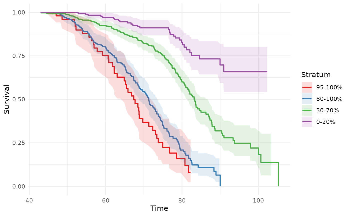
Custom overlapping intervals
Pass a list of c(lo, hi) percentile pairs to
intervals. Bands can overlap freely — each is an
independent Kaplan-Meier fit on the corresponding subset:
phs_km_curve(
  test_data,
  intervals = list(c(0.95, 1), c(0.80, 1), c(0.00, 0.20))
)
#> Warning: Removed 1 row containing missing values or values outside the scale range
#> (`geom_ribbon()`).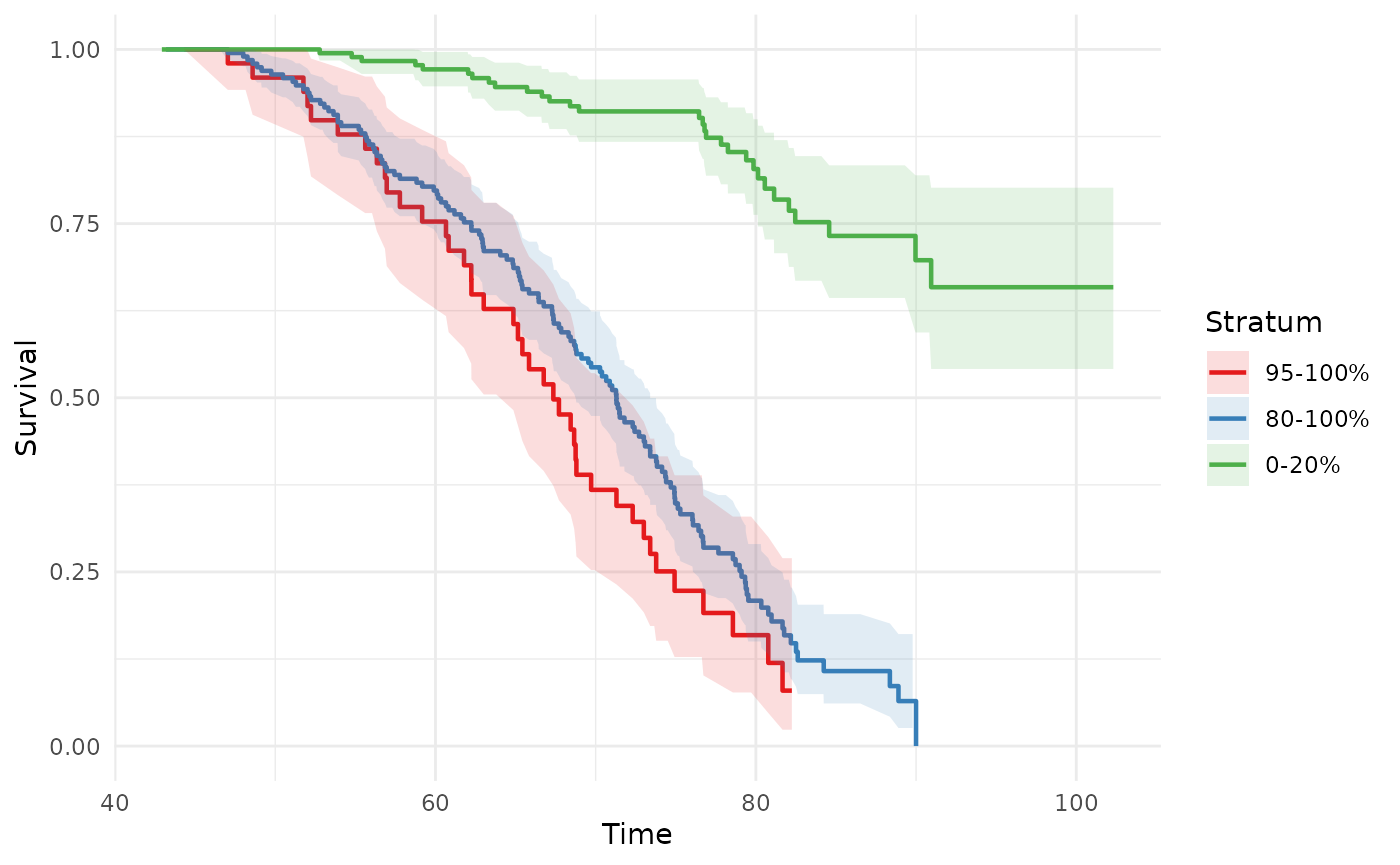
Exclusive bands (legacy breaks)
For non-overlapping bands, use breaks with
intervals = NULL. Pass a numeric vector of percentile
cutpoints (strictly between 0 and 1):
# Quintiles
phs_km_curve(test_data, intervals = NULL, breaks = c(0.20, 0.40, 0.60, 0.80))
#> Warning: Removed 2 rows containing missing values or values outside the scale range
#> (`geom_ribbon()`).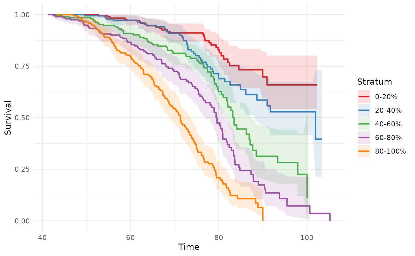
Modifying the ggplot output
phs_km_curve() returns a standard ggplot
object that can be extended with any ggplot2 layers, themes, or
scales:
phs_km_curve(test_data) +
  labs(
    title = "Disease-free Survival by PHS Percentile",
    x     = "Age (years)",
    y     = "Disease-free Probability",
    color = "PHS Group",
    fill  = "PHS Group"
  ) +
  coord_cartesian(xlim = c(40, 100))
#> Warning: Removed 2 rows containing missing values or values outside the scale range
#> (`geom_ribbon()`).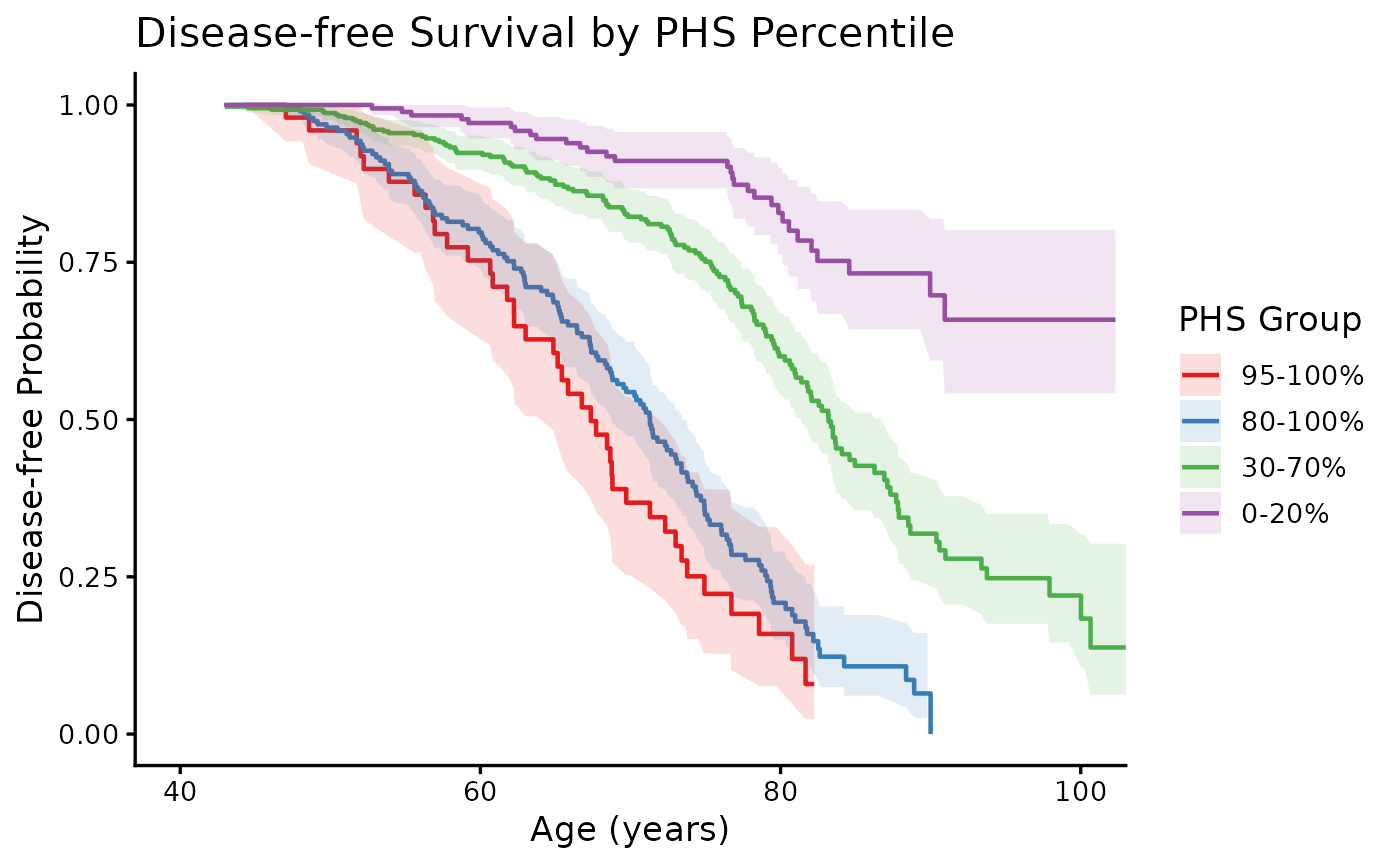
Getting the underlying data
Use output = "data" when you want to build a fully
custom plot or pass the survival estimates on to further analysis:
km_data <- phs_km_curve(test_data, output = "data")
head(km_data)
#>       time  estimate  conf.low conf.high n.risk n.event stratum
#> 1 44.30748 1.0000000 1.0000000 1.0000000     51       0 95-100%
#> 2 47.04070 0.9800000 0.9419529 1.0000000     50       1 95-100%
#> 3 48.14581 0.9800000 0.9419529 1.0000000     49       0 95-100%
#> 4 48.58741 0.9595833 0.9062444 1.0000000     48       1 95-100%
#> 5 51.75902 0.9391667 0.8747578 1.0000000     47       1 95-100%
#> 6 52.01547 0.9187500 0.8454998 0.9983463     46       1 95-100%
The returned data frame has columns time,
estimate, conf.low, conf.high,
n.risk, n.event, and stratum,
which can be used directly with ggplot2:
ggplot(km_data, aes(x = time, y = estimate,
                    ymin = conf.low, ymax = conf.high,
                    color = stratum, fill = stratum)) +
  geom_ribbon(alpha = 0.15, color = NA) +
  geom_step(linewidth = 0.8) +
  scale_color_brewer(palette = "Set1", name = "PHS Group") +
  scale_fill_brewer(palette = "Set1", name = "PHS Group") +
  coord_cartesian(xlim = c(40, 100), ylim = c(0, 1)) +
  labs(x = "Age (years)", y = "Disease-free Probability") +
  theme_minimal()
#> Warning: Removed 2 rows containing missing values or values outside the scale range
#> (`geom_ribbon()`).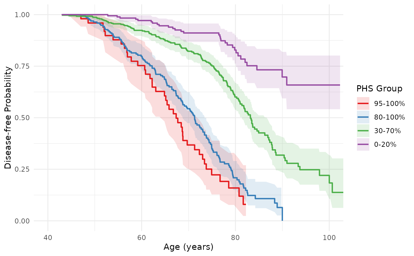
Cox model curves with phs_cox_curve()
phs_cox_curve() fits a Cox proportional-hazards model
(phs as the sole predictor) and returns predicted survival
curves for individuals at specified PHS percentiles. Unlike
phs_km_curve(), these are smooth model-based predictions,
not empirical group estimates.
phs_cox_curve(test_data)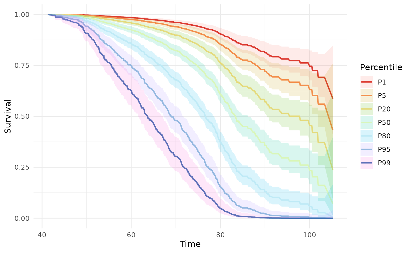
Supply specific percentiles via the percentiles
argument:
phs_cox_curve(test_data, percentiles = c(0.01, 0.10, 0.50, 0.90, 0.99))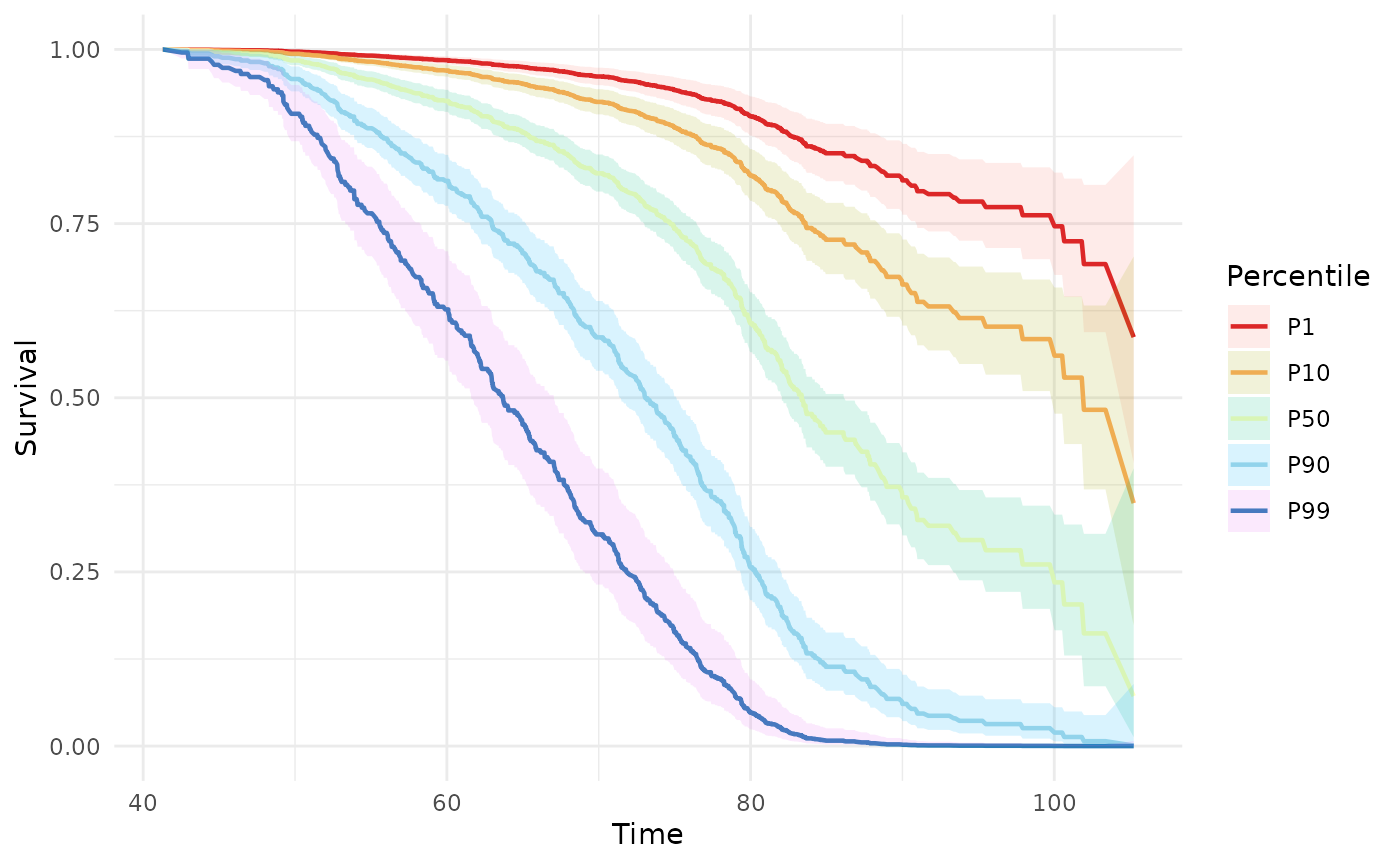
Cumulative incidence curves with phs_abs_risk()
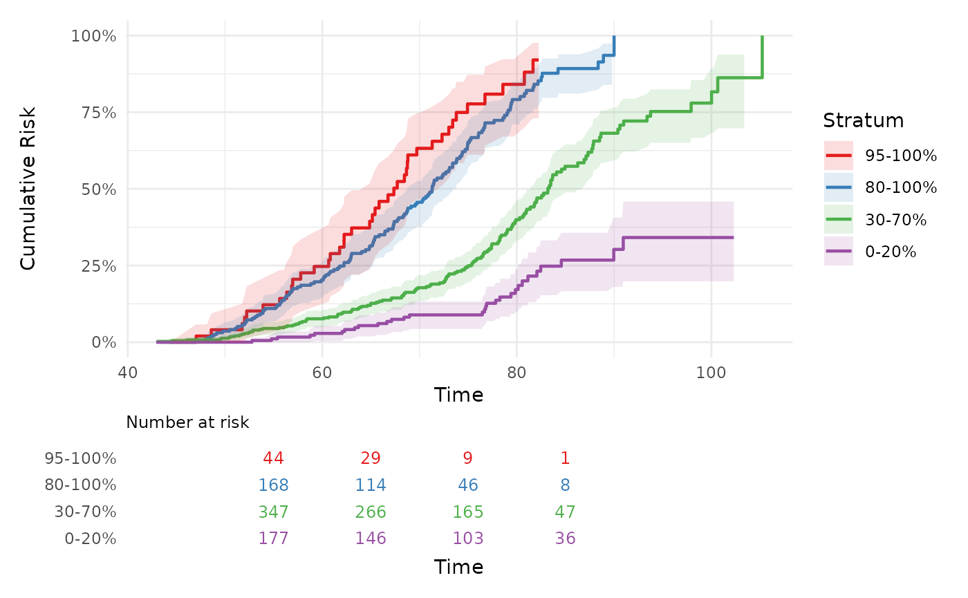
phs_abs_risk() computes absolute (cumulative incidence)
risk curves for percentile-stratified groups. The default
method = "km" plots 1 minus the Kaplan-Meier survival
estimate on a percentage scale. When competing risks are present,
method = "aalen_johansen" uses the Aalen-Johansen
estimator.
The intervals argument works exactly like in
phs_km_curve() — the default four bands (top 5%, top 20%,
middle 40%, bottom 20%) are used when intervals is
omitted:
phs_abs_risk(test_data)
#> Warning: Removed 2 rows containing missing values or values outside the scale range
#> (`geom_ribbon()`).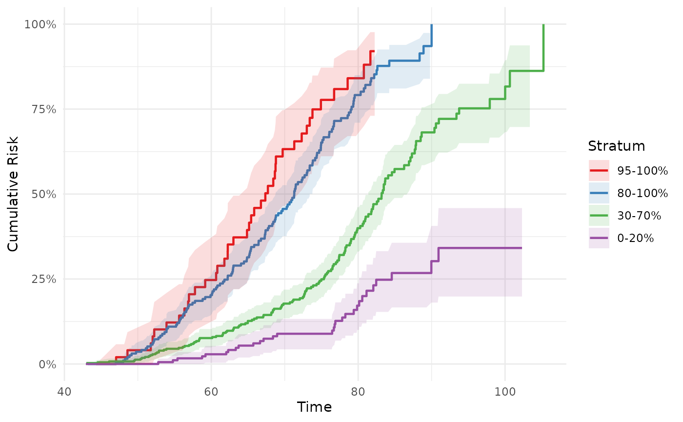
Custom intervals
phs_abs_risk(
  test_data,
  intervals = list(c(0.80, 1), c(0.00, 0.20))
)
#> Warning: Removed 1 row containing missing values or values outside the scale range
#> (`geom_ribbon()`).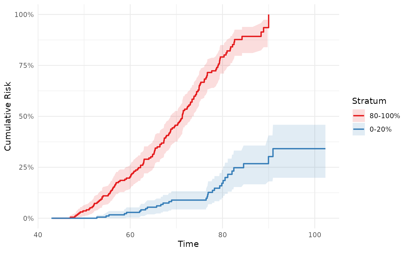
Getting estimates at specific time points
Use output = "data" with time_points to
extract a tidy table of estimates at specific ages — useful for
reporting absolute risk at clinically meaningful time points:
phs_abs_risk(test_data, time_points = c(60, 70, 80), output = "data")
#>    time stratum risk_estimate    conf.low  conf.high n.risk n.event
#> 1    60 95-100%    0.24707317 0.115293115 0.35922415     37       1
#> 2    70 95-100%    0.63219092 0.464673706 0.74728773     17       0
#> 3    80 95-100%    0.84077529 0.670551926 0.92304551      5       0
#> 4    60 80-100%    0.20254505 0.142786038 0.25813808    142       1
#> 5    70 80-100%    0.45628313 0.376124061 0.52614292     86       0
#> 6    80 80-100%    0.79133234 0.709948858 0.84988098     24       0
#> 7    60  30-70%    0.07625721 0.048644740 0.10306824    308       0
#> 8    70  30-70%    0.17768594 0.134482438 0.21873287    217       1
#> 9    80  30-70%    0.39959810 0.330699268 0.46140438     95       1
#> 10   60   0-20%    0.02859979 0.003548203 0.05302157    161       0
#> 11   70   0-20%    0.08894279 0.043071252 0.13261543    120       0
#> 12   80   0-20%    0.17165947 0.100210141 0.23743525     65       0
Risk table
Use phs_risk_table() to build a numbers-at-risk strip as
a standalone ggplot, then combine it with your curve plot using
attach_risk_table() or patchwork directly. This keeps both
objects as editable ggplots so you can customise them independently
before combining.
# Quick usage: let attach_risk_table() build the table from the data
p <- phs_abs_risk(test_data)
attach_risk_table(p, test_data)
#> Warning: Removed 2 rows containing missing values or values outside the scale range
#> (`geom_ribbon()`).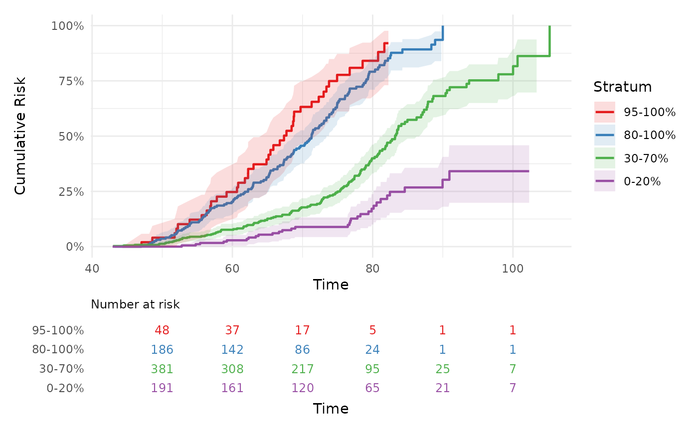
For publication-ready plots, build and customise each object
separately, then combine. The time_points argument controls
at which ages columns appear:
library(patchwork)

p  <- phs_abs_risk(test_data)
rt <- phs_risk_table(test_data, time_points = c(55, 65, 75, 85))

p / rt + plot_layout(heights = c(3, 1))
#> Warning: Removed 2 rows containing missing values or values outside the scale range
#> (`geom_ribbon()`).